Home Knowledge Base Designing for VR: essential tips for immersive 3D experiences
Designing for VR: essential tips for immersive 3D experiences
12th March 2019

Designing for digital applications often follows core principles such as alignment and limiting font use. But virtual reality (VR) and 360 experiences demand a different approach. In 3D worlds, style, function, and spatial awareness all need careful consideration.
Key principles for designing in 3D
Focus on the finer details
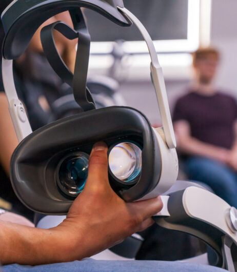
VR lenses distort images, making fine lines, small fonts, and delicate patterns harder to see. Antialiasing is essential, particularly for pre-rendered 360 experiences. Typography should be slightly bolder than usual, and menus, buttons, and graphics should be larger to ensure clarity in the 3D environment.
Less is more
You don’t need to fill every inch of a 360 sphere. Consider visual hierarchy and user comfort. Leading lines and small, natural movements help users absorb information without overloading their peripheral vision or causing neck strain.
Keep it grounded
Infinite or bright white spaces can feel disorientating or visually fatiguing. Adding subtle gradients or cues in the virtual environment helps users feel grounded and enhances the sense of 3D realism.
Play around
Experimentation is key. Mock up ideas in Photoshop, then test them in Unity alongside your developers. Iterating within the actual VR space ensures your designs are not just visually appealing but also functional and comfortable for users.
Think outside the box
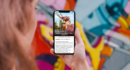
Consider the type of hardware and user journey. Some experiences, especially linear ones, can start on a 2D screen before the headset is worn, making setup easier. Interactive experiences require careful design so users can navigate intuitively.
Testing and user experience
Designing for VR requires balancing eye-catching visuals with clarity and usability. Testing with users of all abilities ensures your interface is intuitive and accessible. Avoid assuming technical familiarity. When done well, your 3D world can transport users into fully immersive experiences.
Related posts


